Hatchwatches
growing a brand community through an omnichannel customer experience
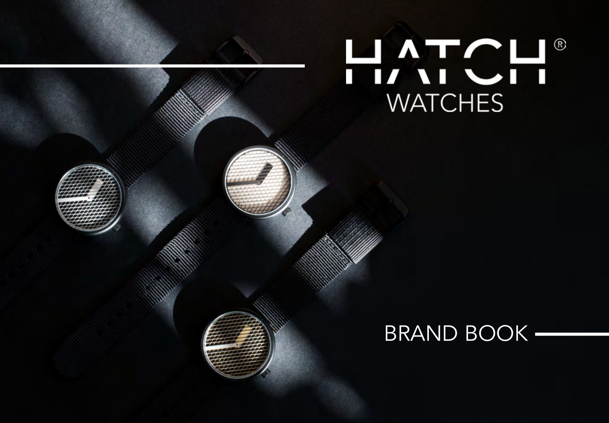
Hatch Watches is a creative watch brand based in East London that sells minimalist watches that change patterns with time.
As the co-founder, I built the company and the brand from the ground up with one partner. As a director, I was responsible for all the business activities. As principal designer, I designed the product and created the entire look and feel of the brand.
Timeline
2017 – 21
Company
Hatch Watches Ltd
Team
2 co-founders, 2 graphic designers
Role
Co-founder / Director
Skills
B2C management / Product Design / Customer experience / e-commerce / Digital content strategy
Tools
Adobe CC, Adobe XD, Wix, html, css Excel, social media
Link
How to design, launch and grow a product and a brand?
1
Develop an original product idea
2
Build the brand
3
Build the experience
4
Build the community
Develop an original product idea
From concept to product
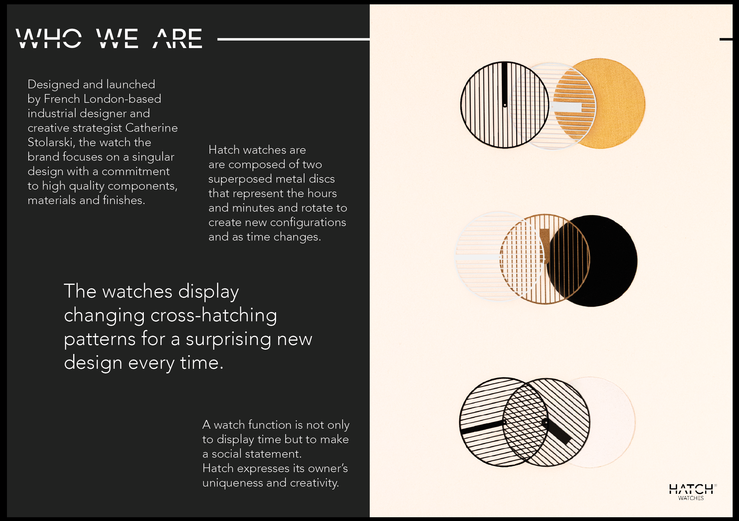
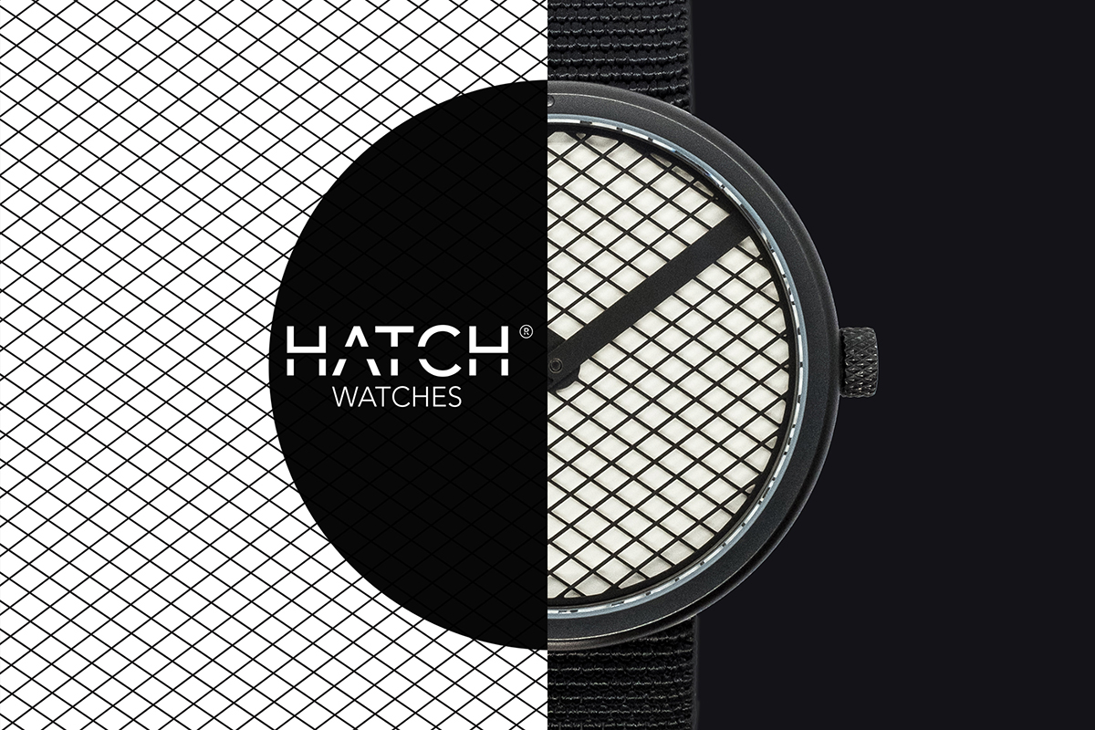
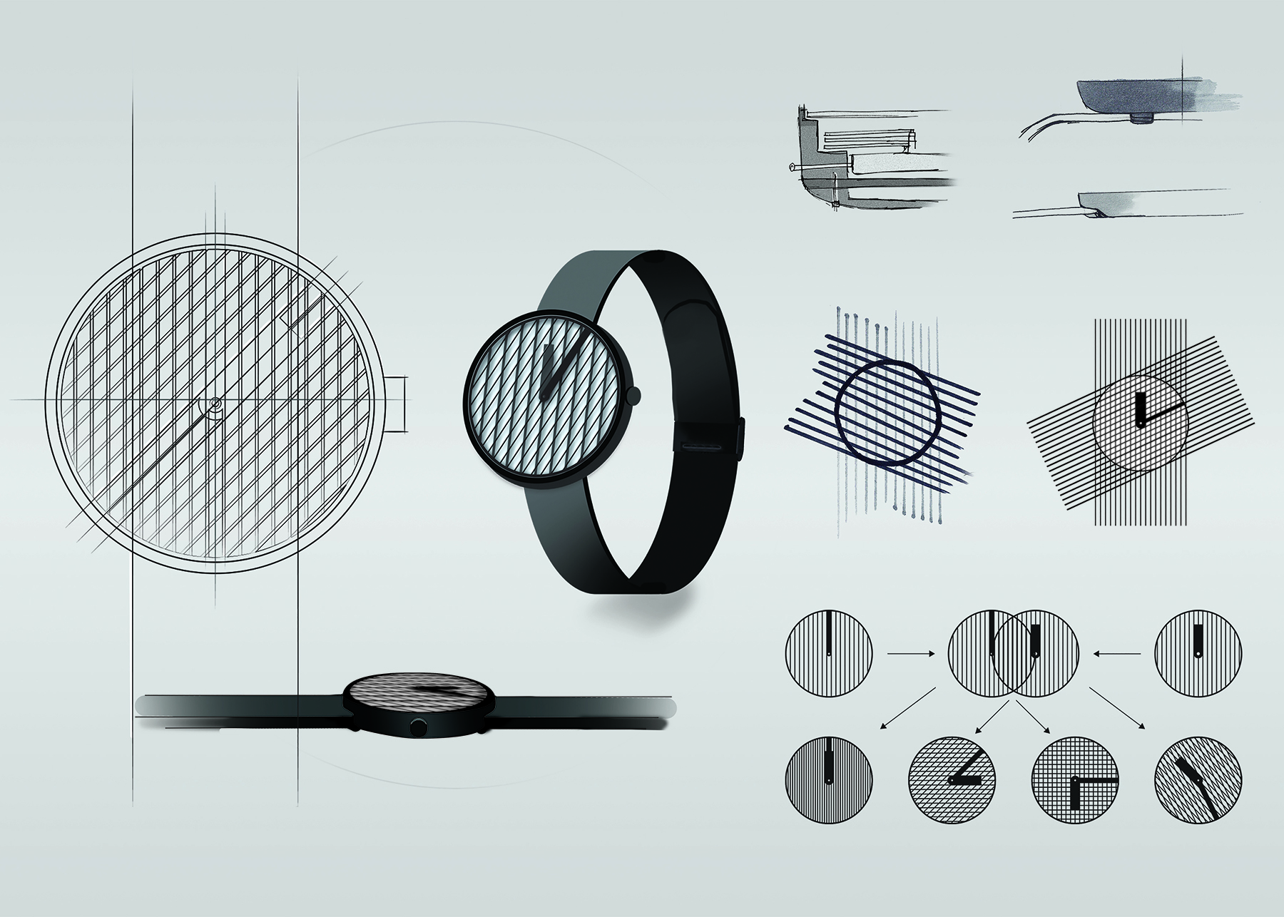
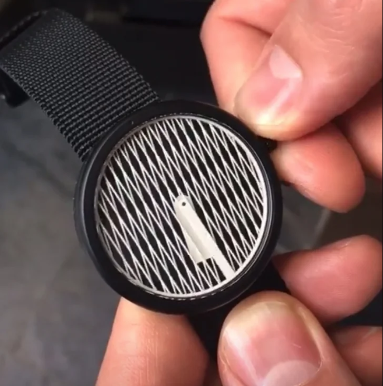
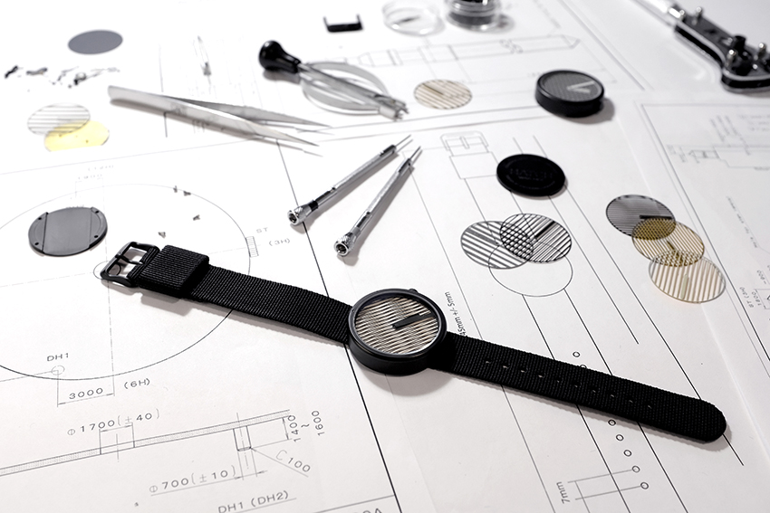
The uniqueness of the watches comes from their dial that creates different cross-hatching and moire patterns when the time changes.
The principle is simple: two superposed etched metal discs rotate over each other and create changing patterns as time goes by. Hatch comes from the hatching and moire effect seen on the dial.
Using graphic design software, I designed the dial and hands to be superposed. I designed and assembled all the components on 3D software.
Using additive manufacturing, we created iterations of the case, buckle and hands and tested/improve them to get to the final design.
Test and define the market
We had six months with our physical product to test its durability and quality before launching the production as well as collecting feedback from friends and contacts on how they perceive the product and in which setting they picture it to be and the price range at which they would likely purchase it.
This allowed us to determine the manufacturing budget, and the business model, along with some predictions before filing the company creation.
Follow the manufacturing process
I oversaw the production journey from designing and delivering the final CAD files and technical requirements, to control the development and production by engineers and manufacturers.
I sourced the final materials and decided on the finishes until receiving the final products.
Build the brand
Run a Market Analysis
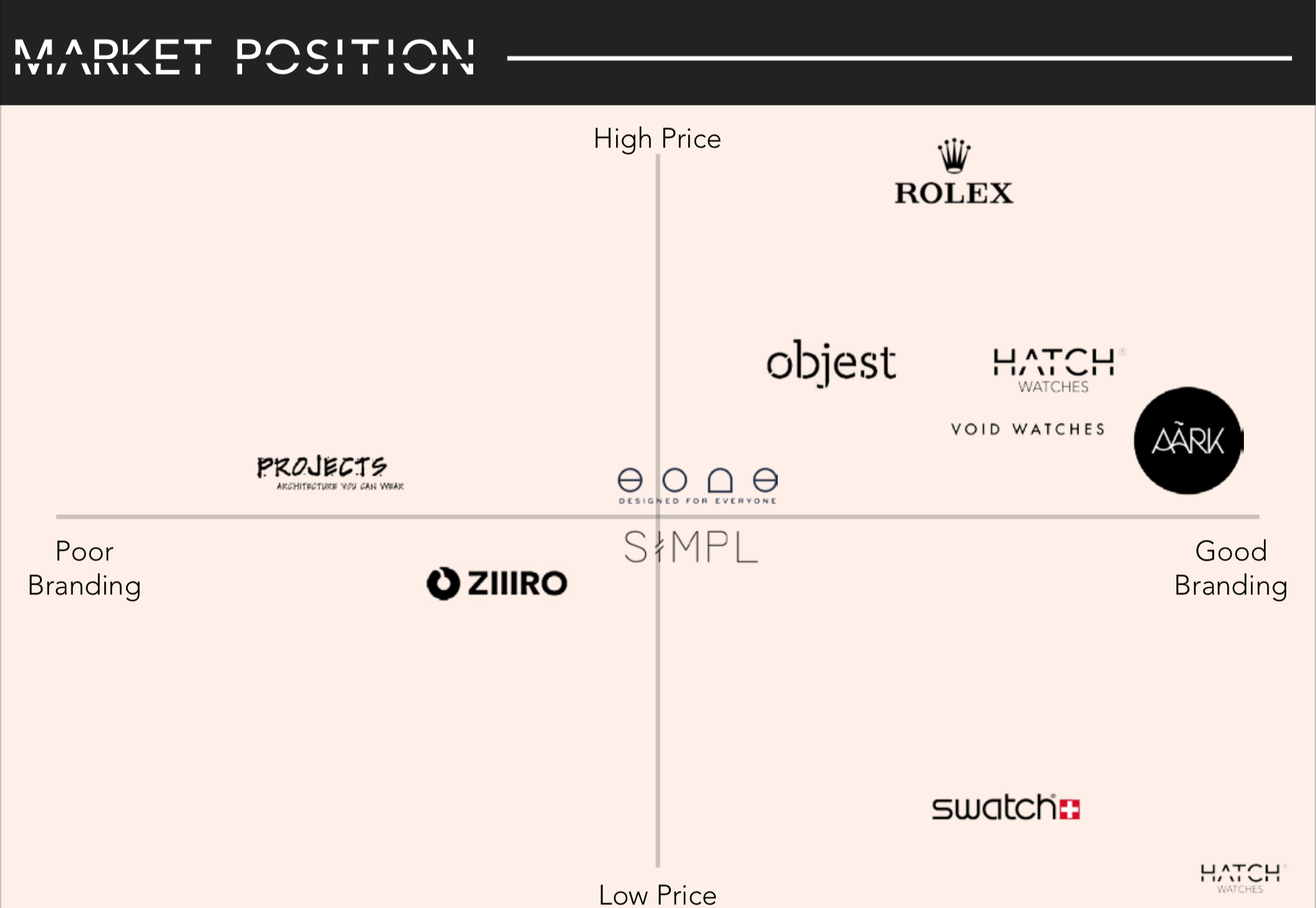
Before deciding on the brand and sales strategy, I had to get a better understanding of the market, how similar brands were perceived and determine our positioning.
I first researched the European and North American watch markets before narrowing down on our direct competition.
Key metrics
23%
of watch sales are electronic or quartz
77%
of watch sales are mechanical or automatic
88%
of the industry is owned by swiss made watches
25%
are owned by the Swatch group
with $8.88B in 2011
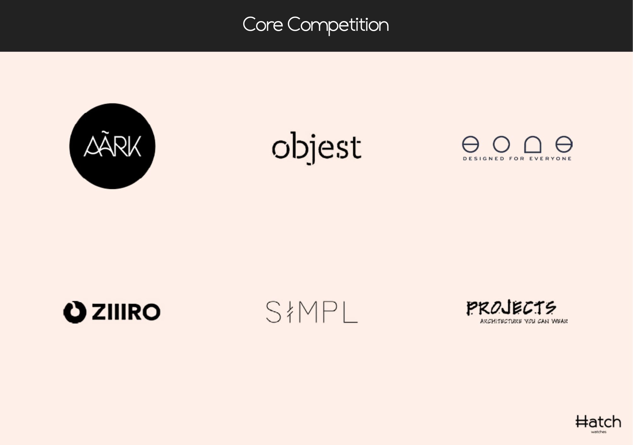
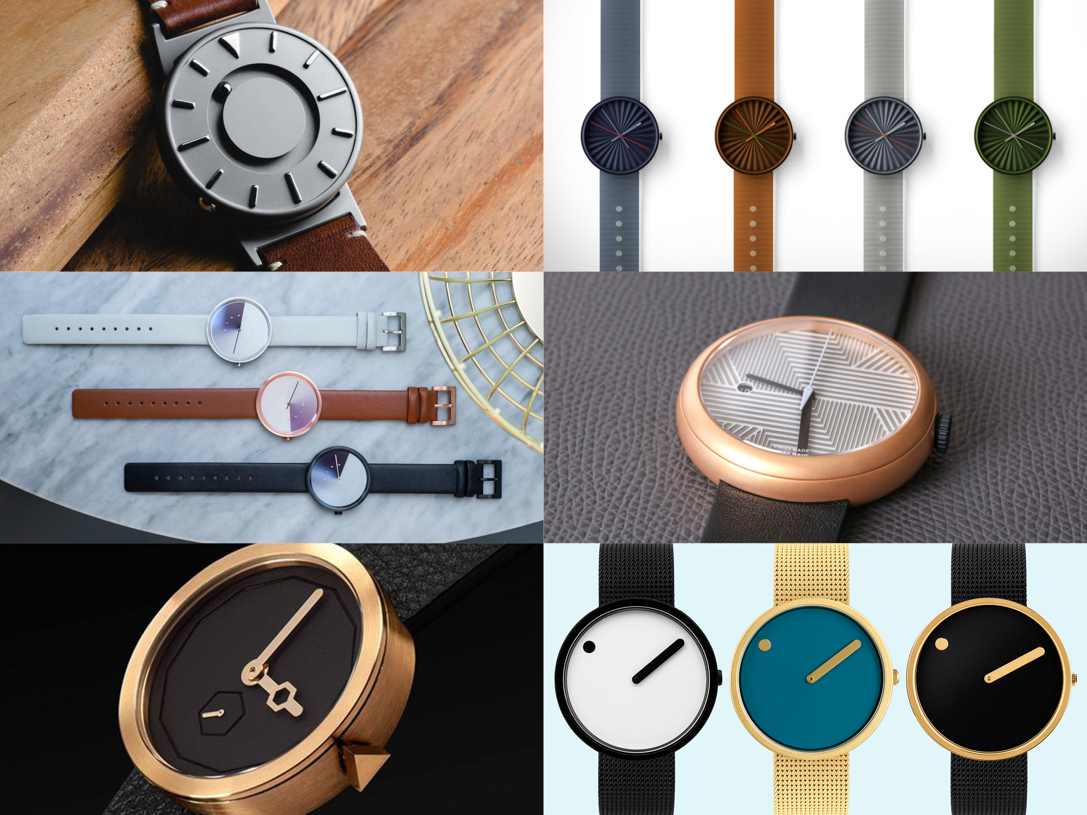
I then looked closer at the creative watch market in Europe and North America to understand the gaps in the industry and position our company.
Brand Writup
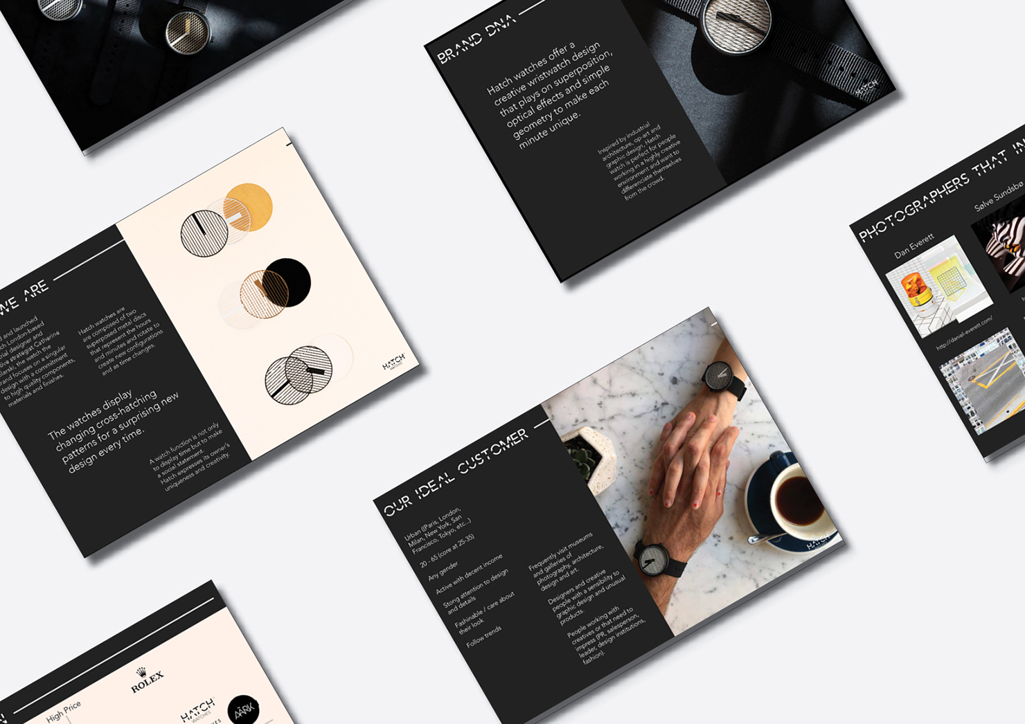
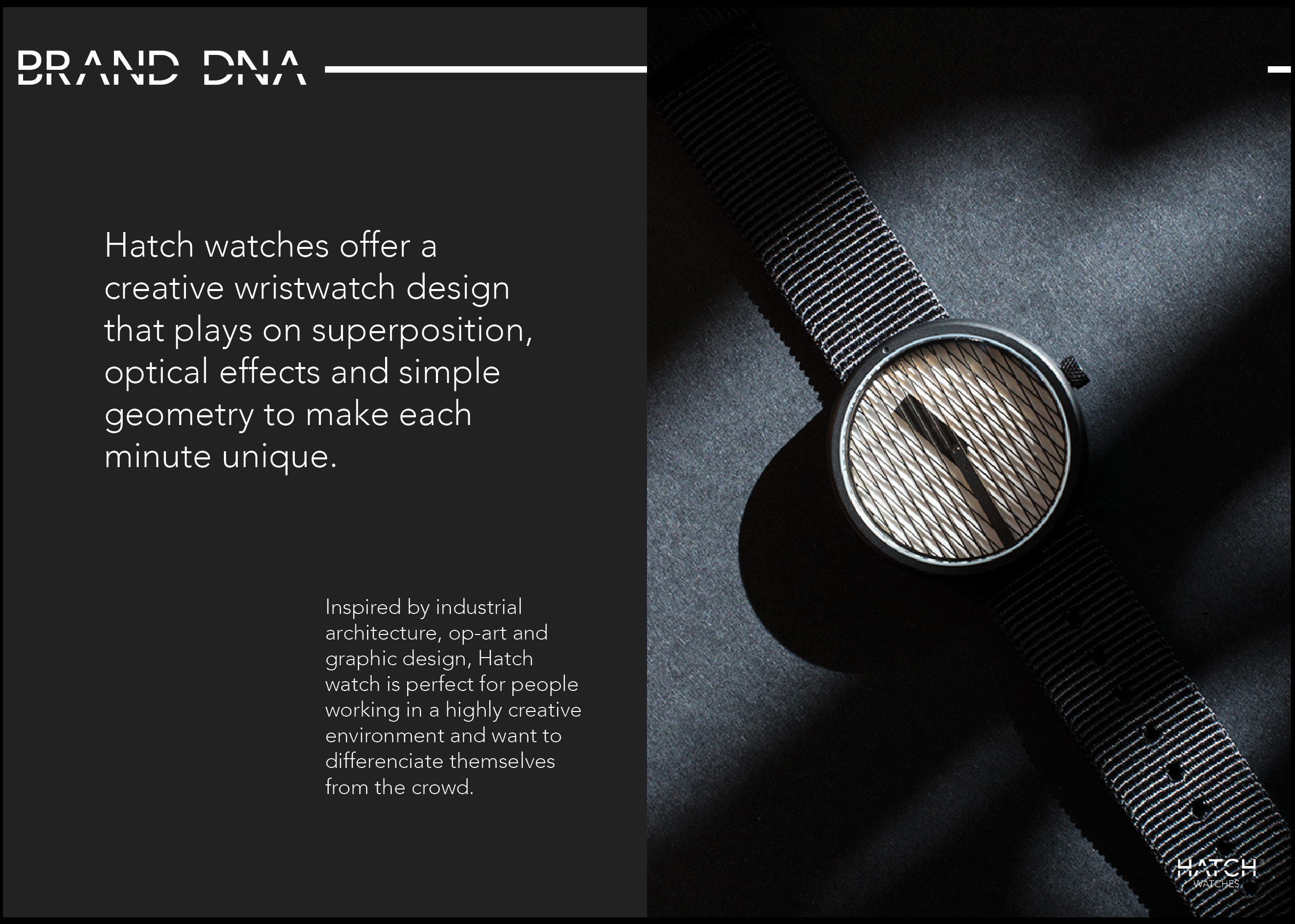
Hatch Watches is set to be a creative watch brand that speaks to design lovers and is sold through its online store. Their first collection is inspired by London architectural landscape.
Within a constantly evolving market, cultivating its uniqueness and telling the story of a brand was key. Being a designer selling to designers was an opportunity to trigger affinities with the targeted customers.
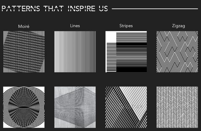
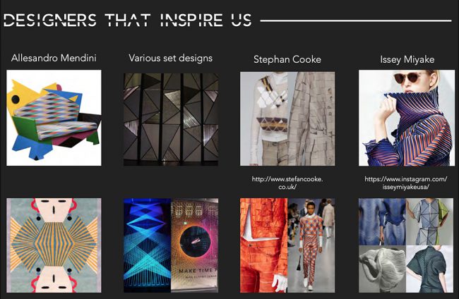
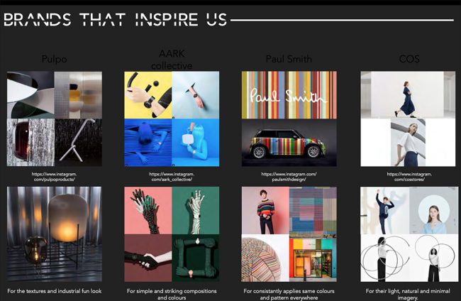
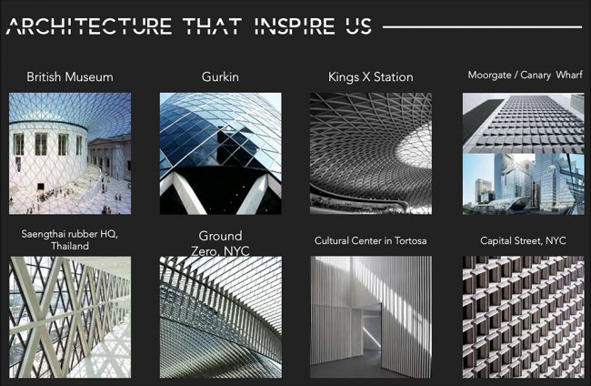
I gathered visual inspiration from art and architecture to create a rich universe.
Build the experience
The long-term process is to gain visibility, and credibility, then build familiarity and get the endorsement. As for implementing a homogeneous customer experience, these are the steps:
Craft a strong visual identity
I brainstorm with two graphic designers to help me get some perspective on my logo design.
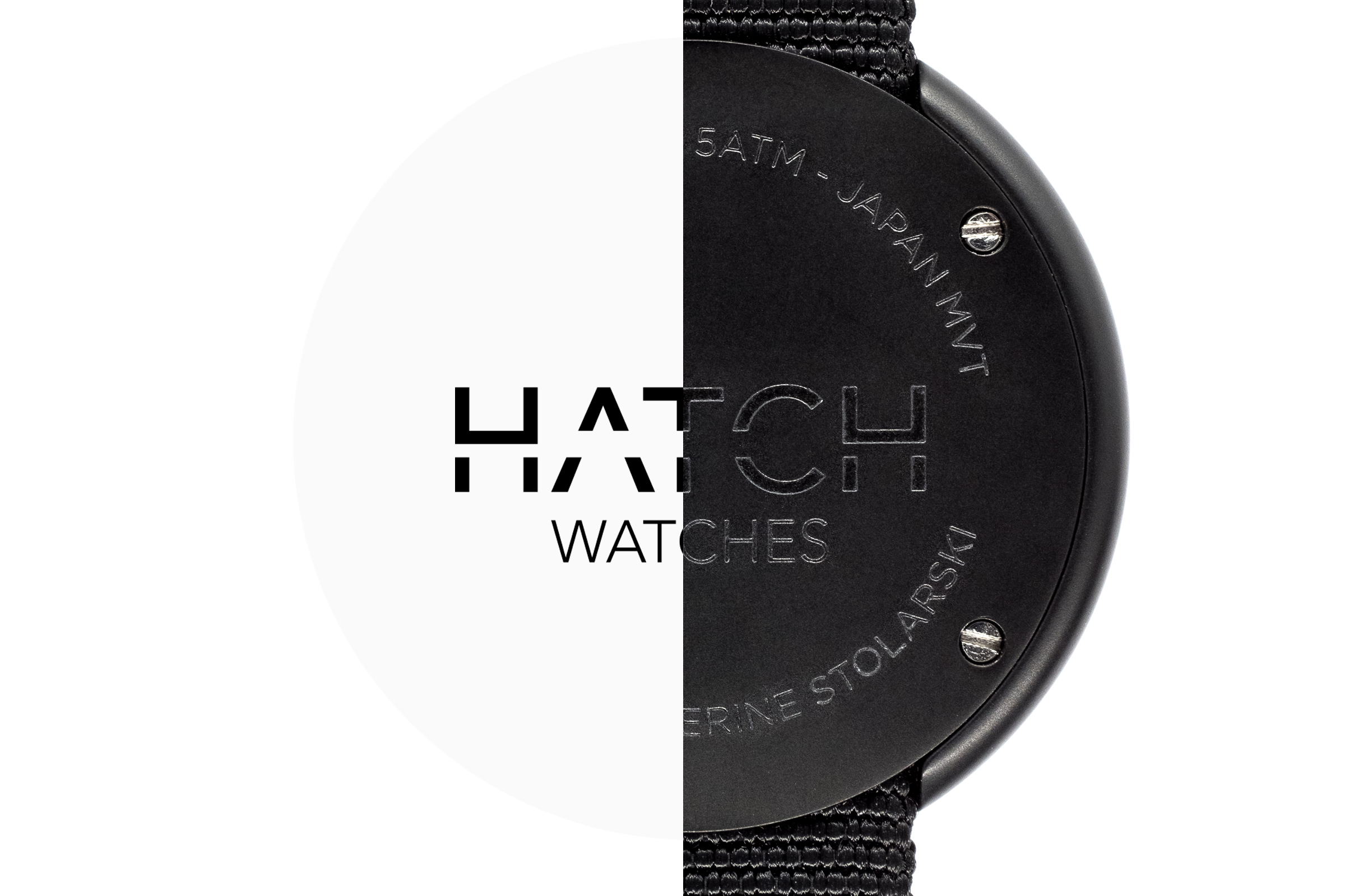
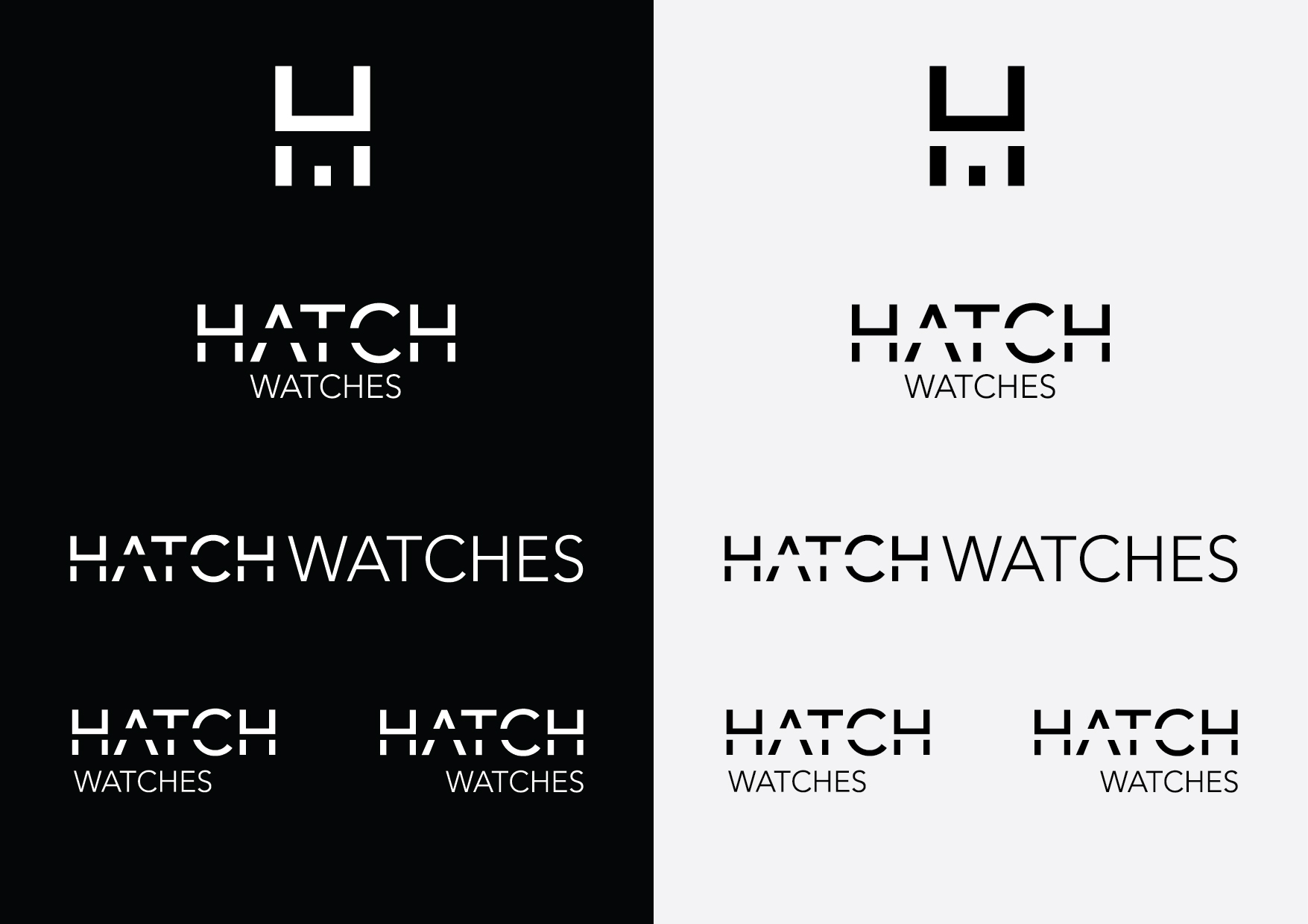
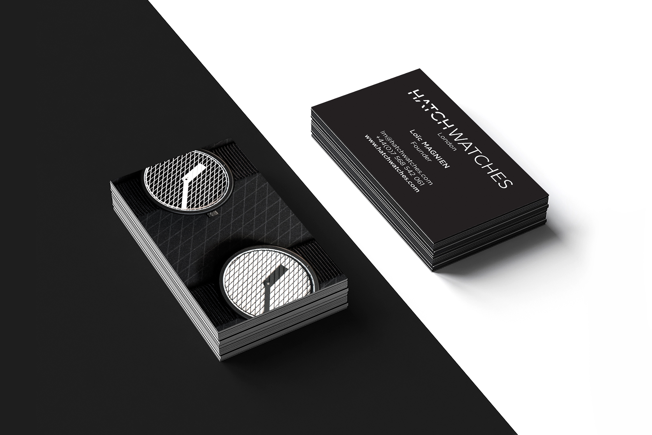
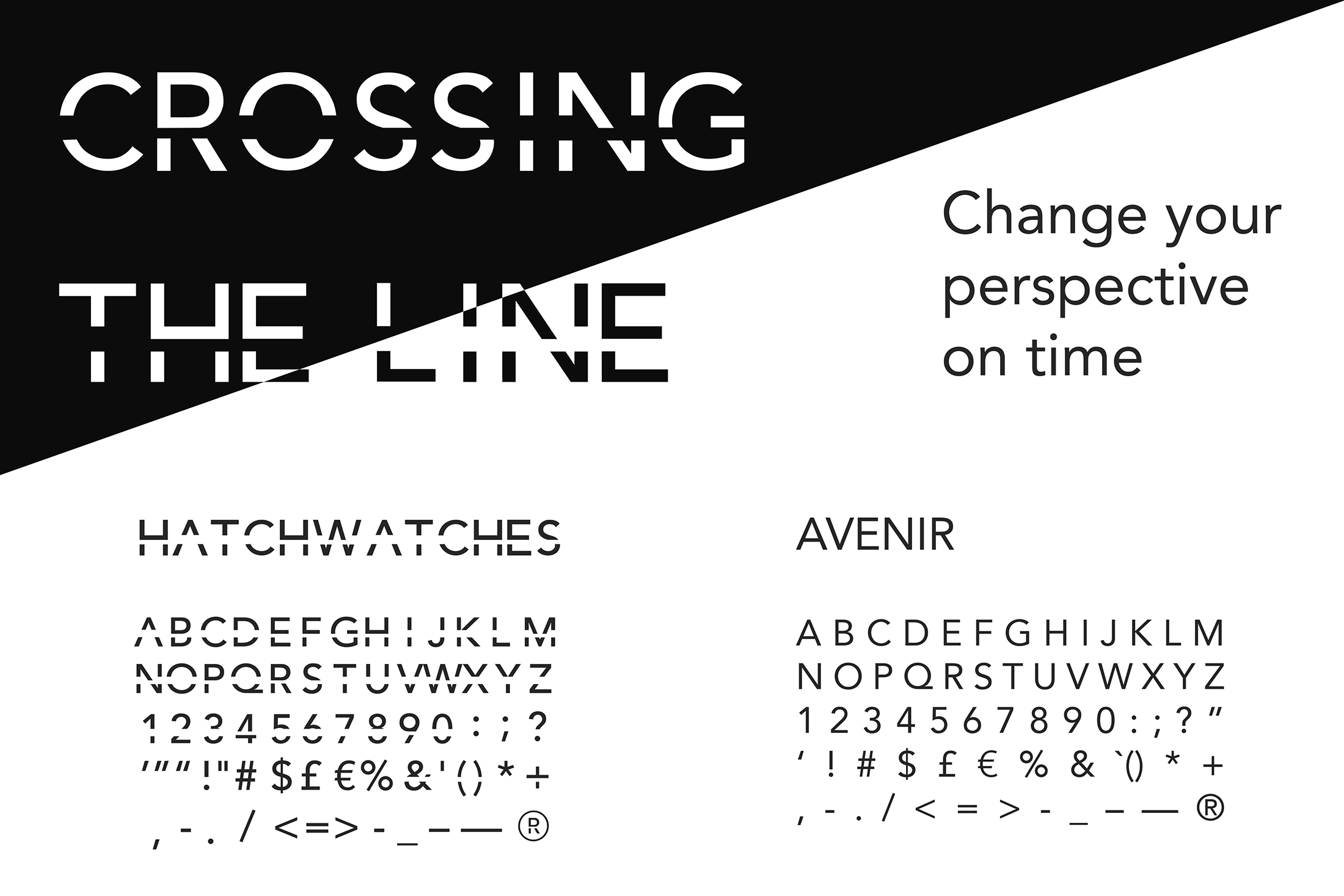
I crafted a black-and-white identity and custom typeface, inspired by the iconic design of Hatch Watches timepieces.
Design a unique unboxing experience
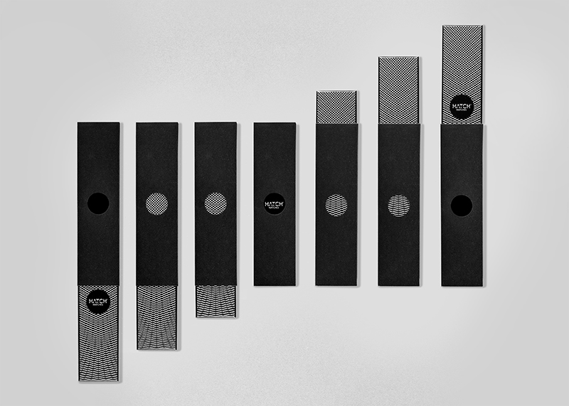
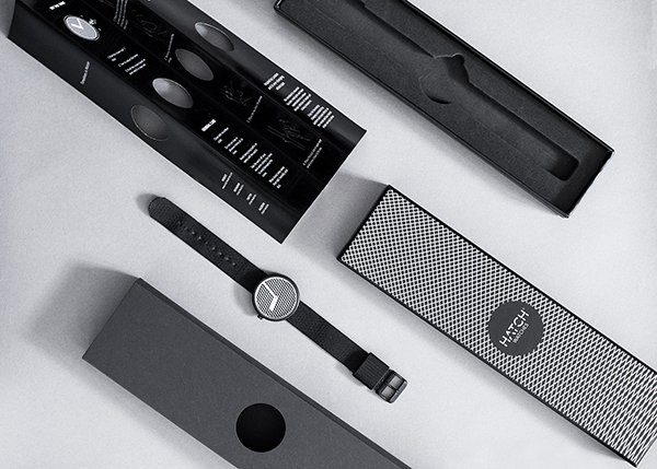
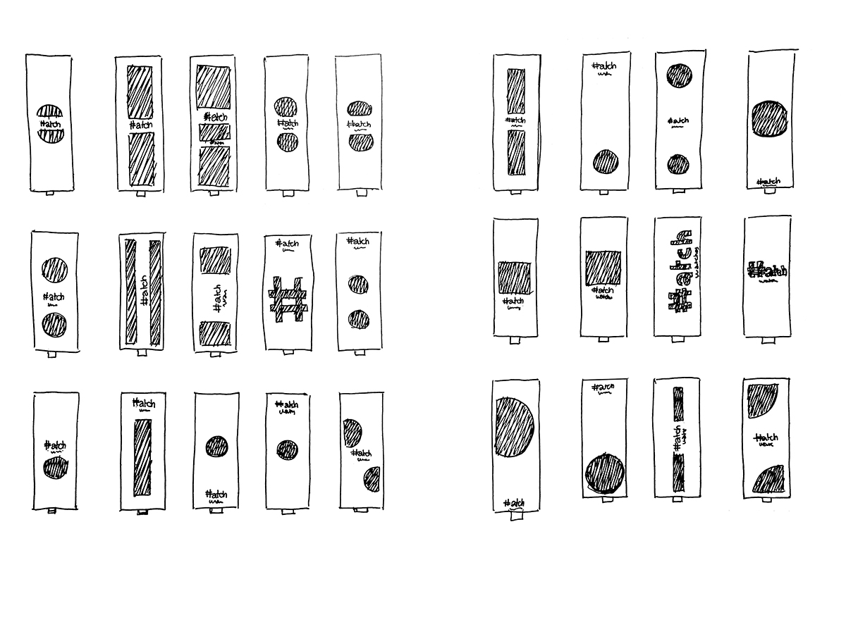
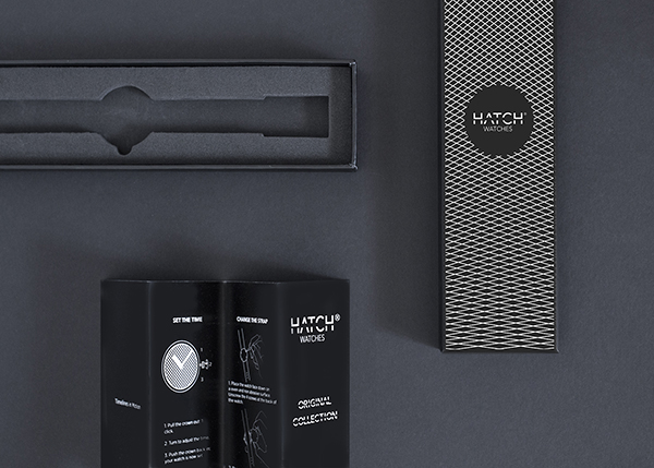
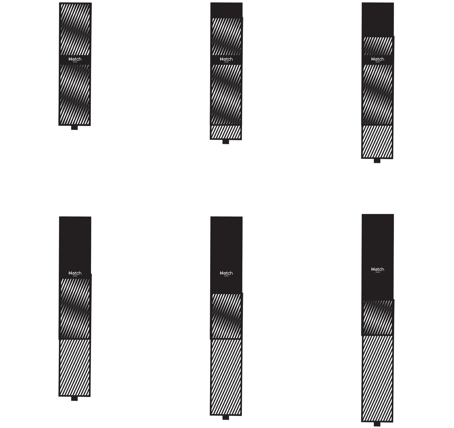
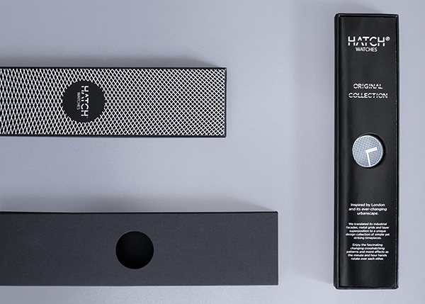
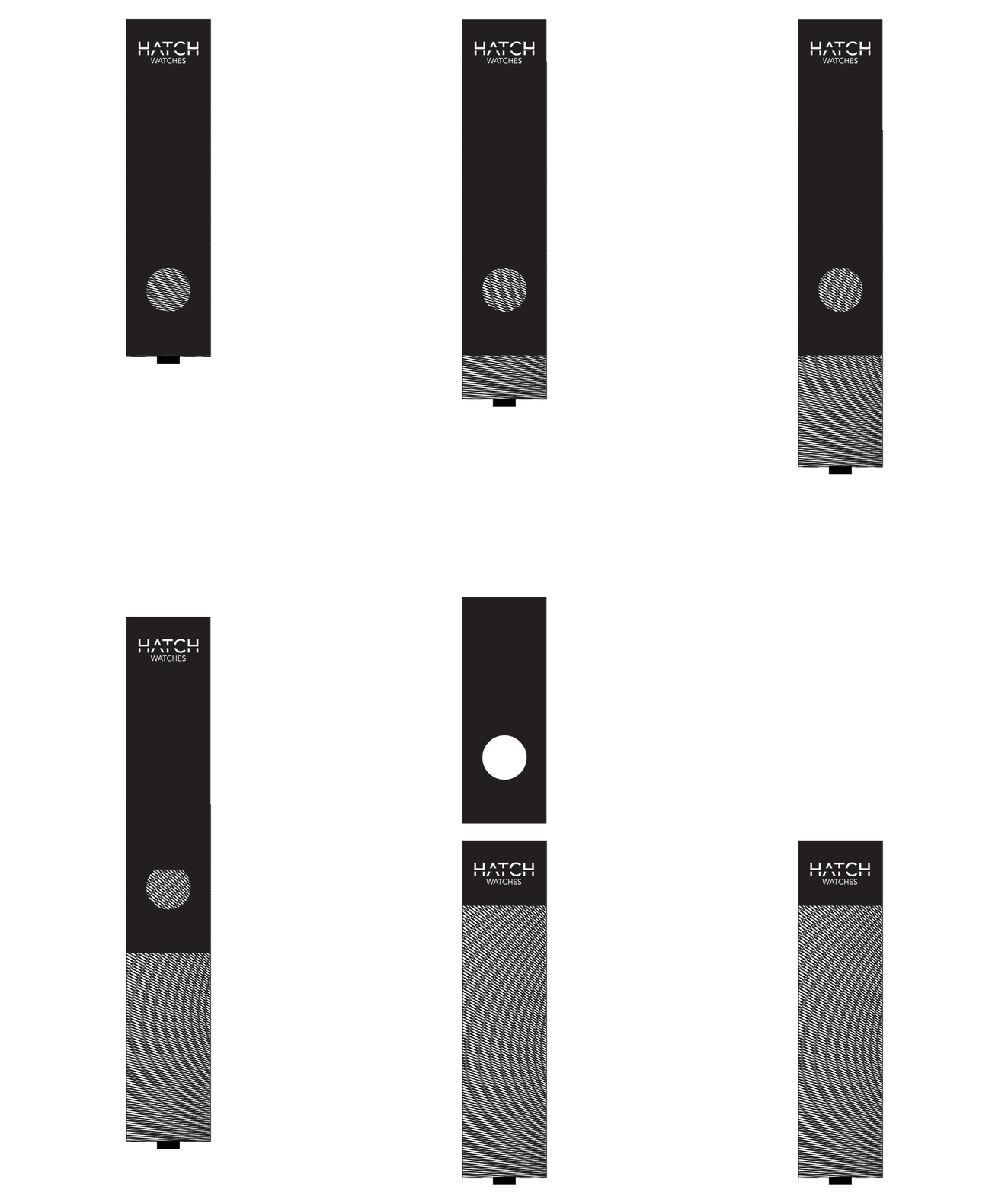
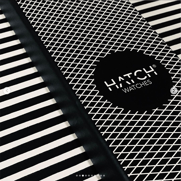
I wanted the unboxing experience to be tied with the watch design and to be completely unique. I explored different versions around the idea of having an illusion of moving patterns when removing the lid from the sleeve. The packaging had to be feasible, cost-effective, and protect the watch during shipping.
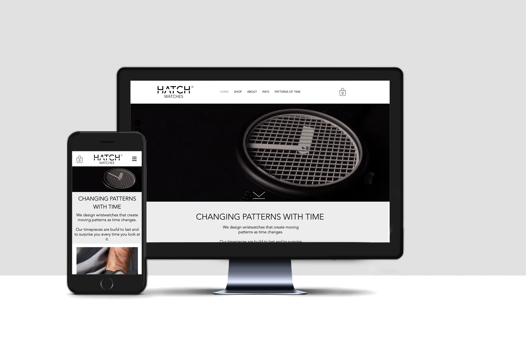
Build a responsive e-commerce platform
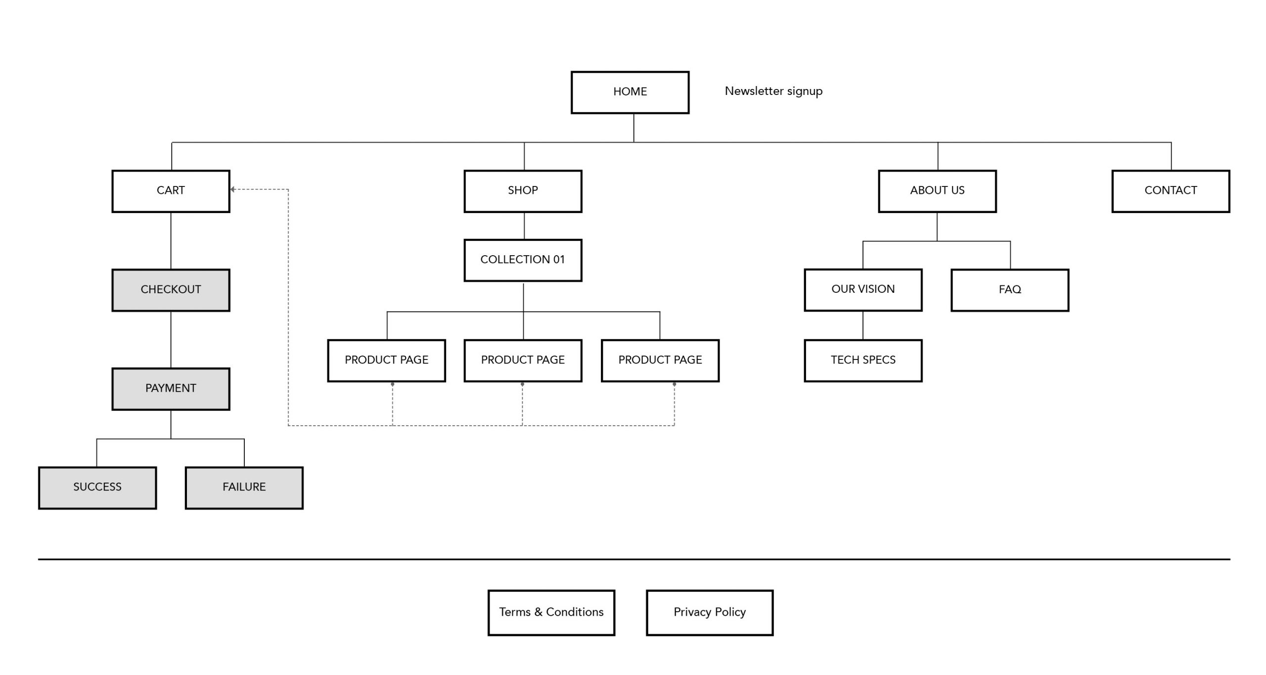
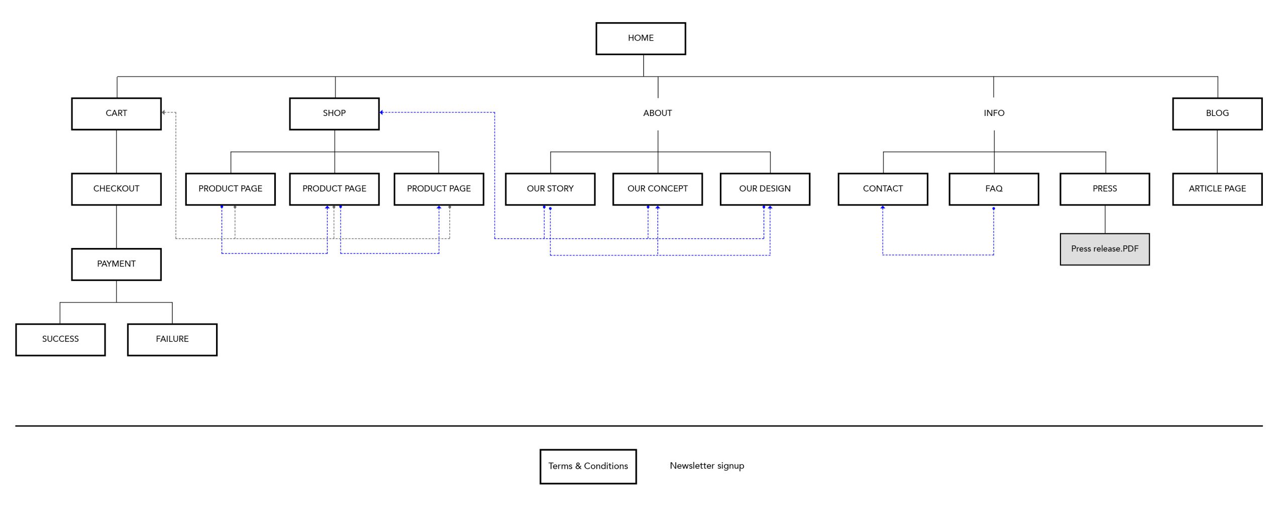
I organised the content and drew the site map.
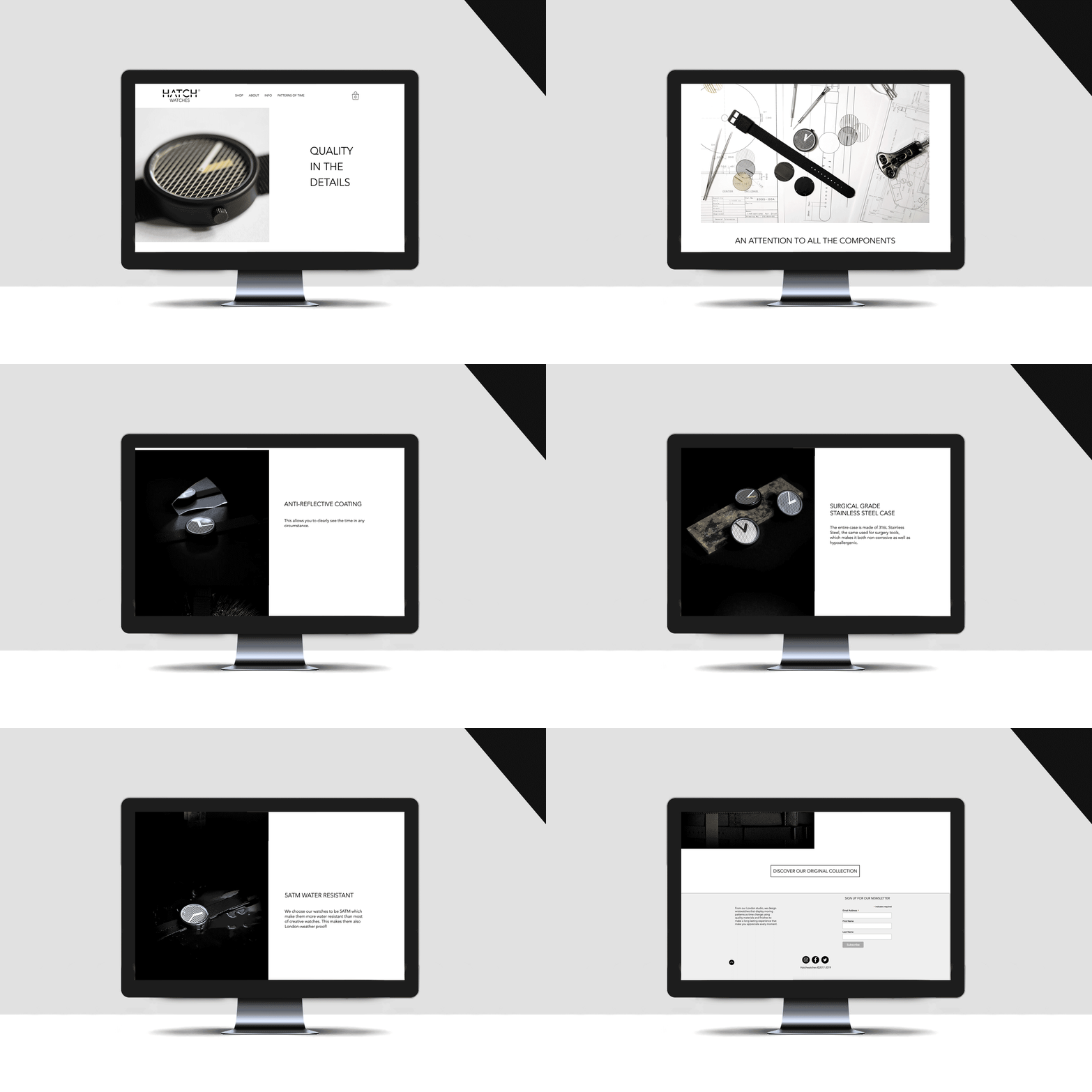
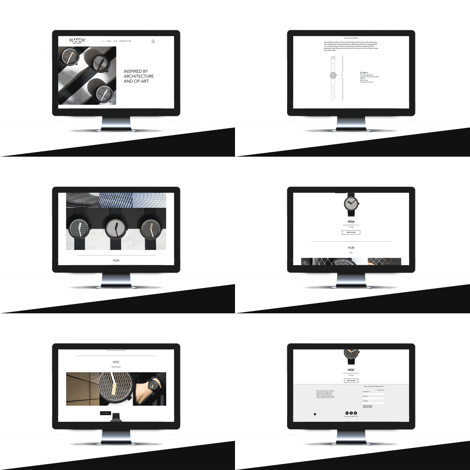
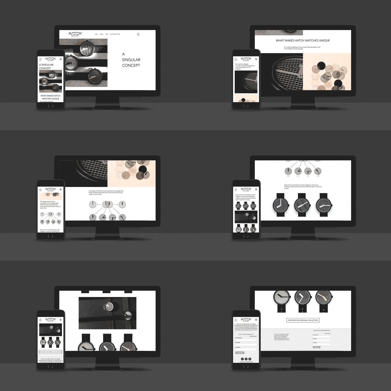
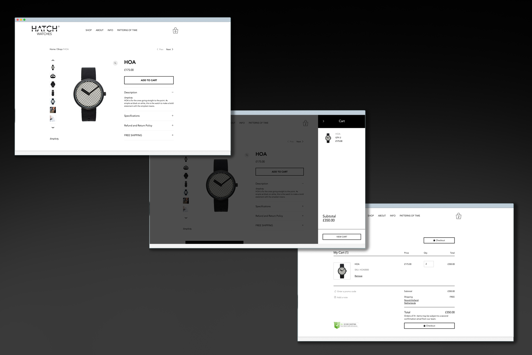
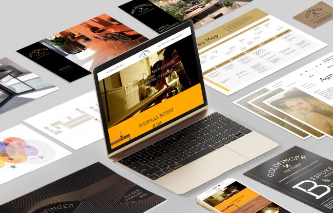
Here are previews of the final version of the website.
Build a community
Getting to know our online customers
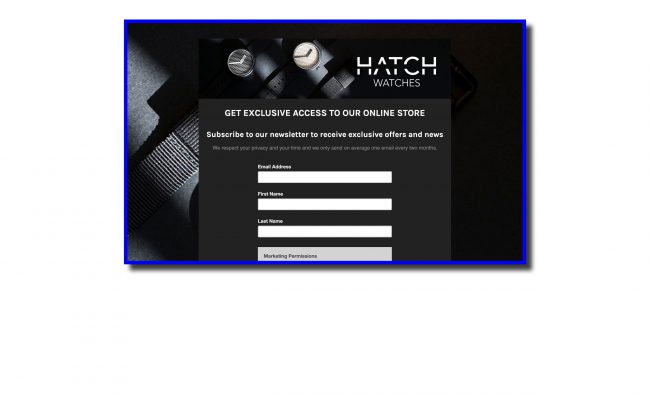
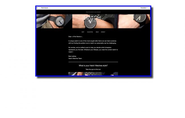
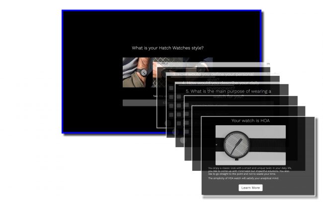
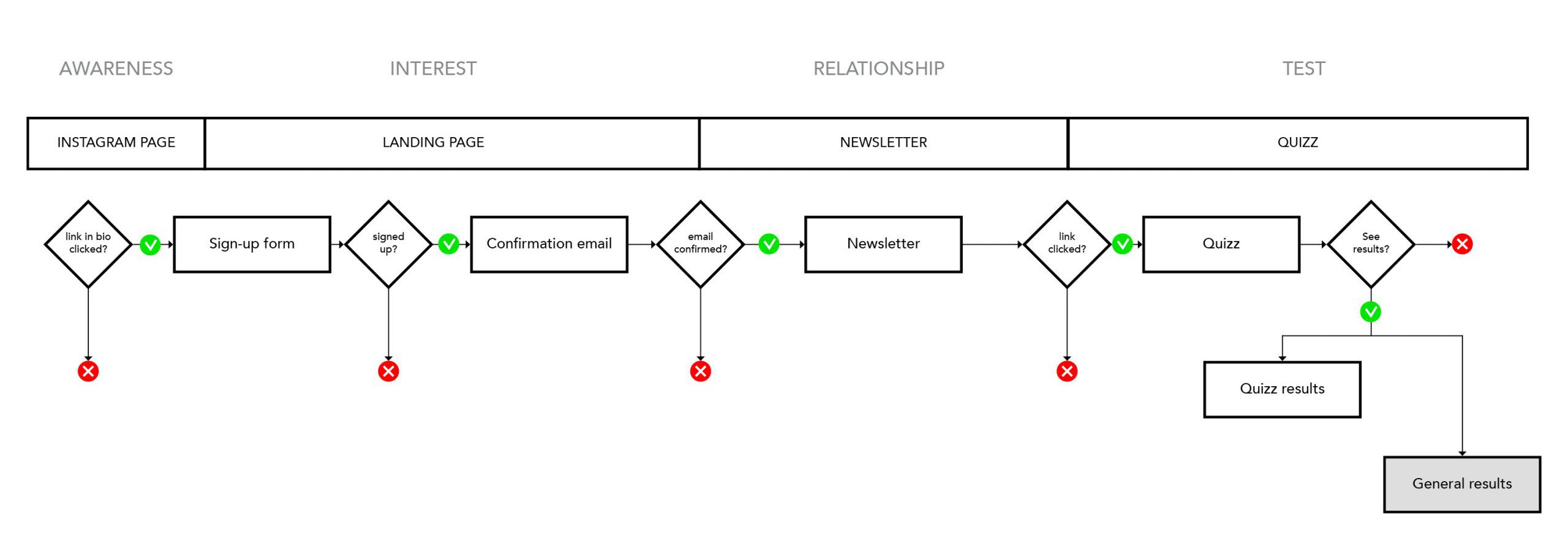
I quickly put in place a system to capture leads online through a landing page. I then sent them a quiz in one of the newsletters. The gathered answers allowed me to collect a little bit more information about our customer profile.
Meeting our customers
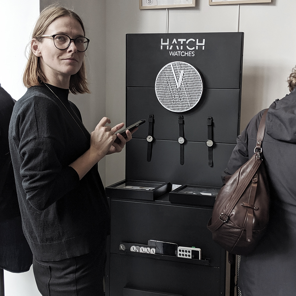
We had the chance to be part of a few pop-ups which was a unique occasion to meet our customers in person and get a better understanding of how people react to our brand and product.
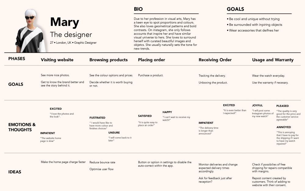
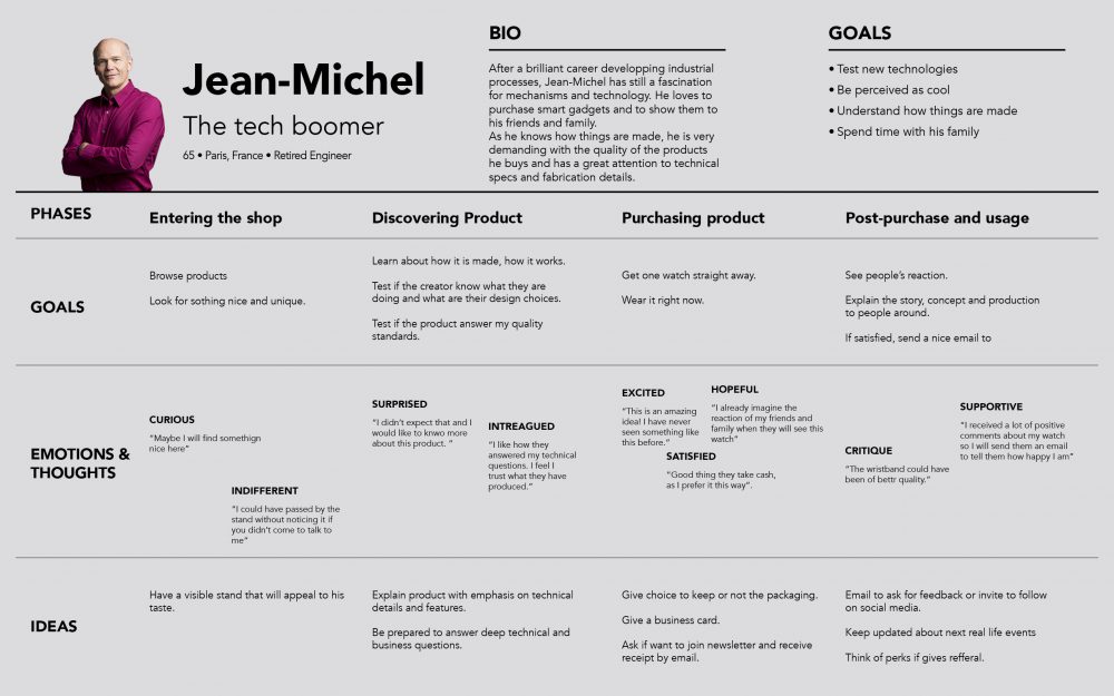
Personas and customer journeys
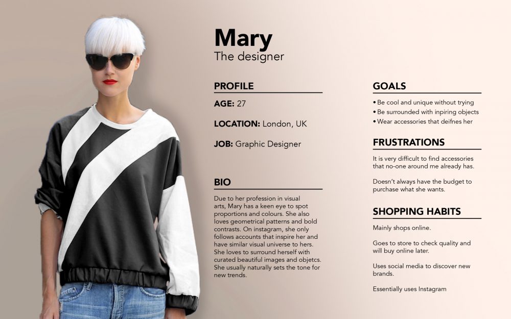
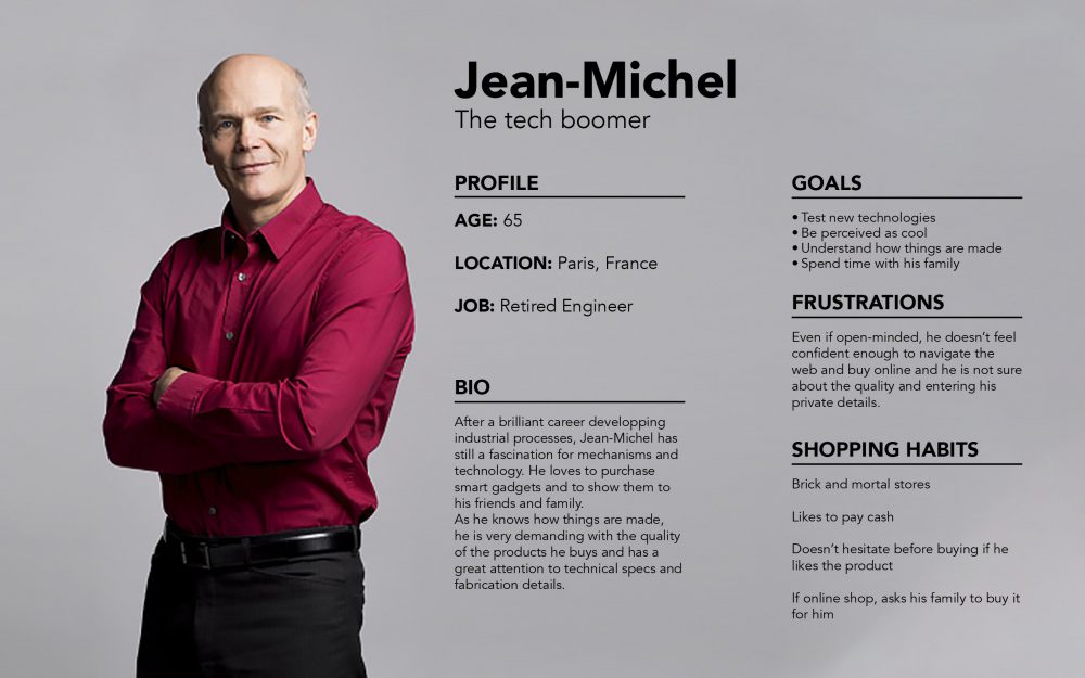
I identified two personas.
A young design professional or artist with a high aesthetic and curated taste.
A tech boomer with a passion for gadgets and well-crafted creative items.
With the data collected, I was able to map each of their journeys and have a clear understanding of their experience and of the pain points we had to work on.
Define a social media content strategy
The challenge is to create a community of satisfied customers that will engage with the brand and advocate our product.
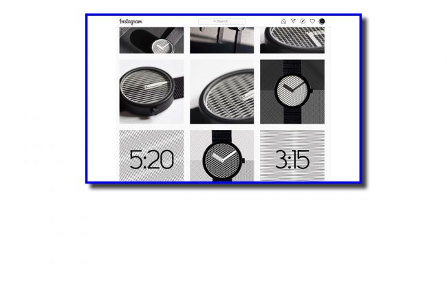
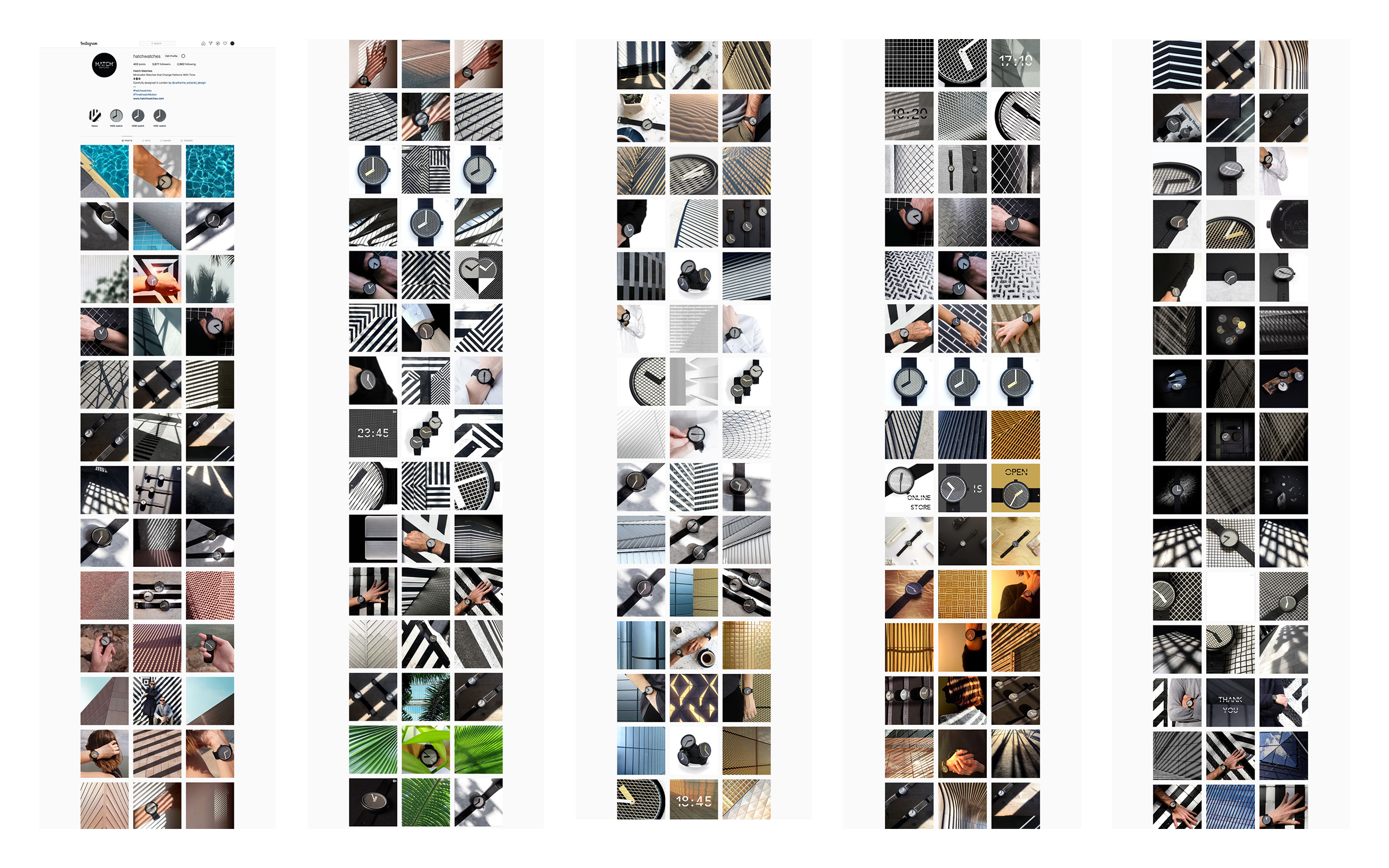
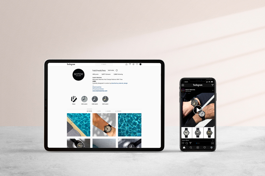
I deployed a digital marketing strategy and created content for campaigns and collaborations. This includes photography, videos, 3D and 2D animations as well as copywriting and hashtag selection.
Refine the experience on our website
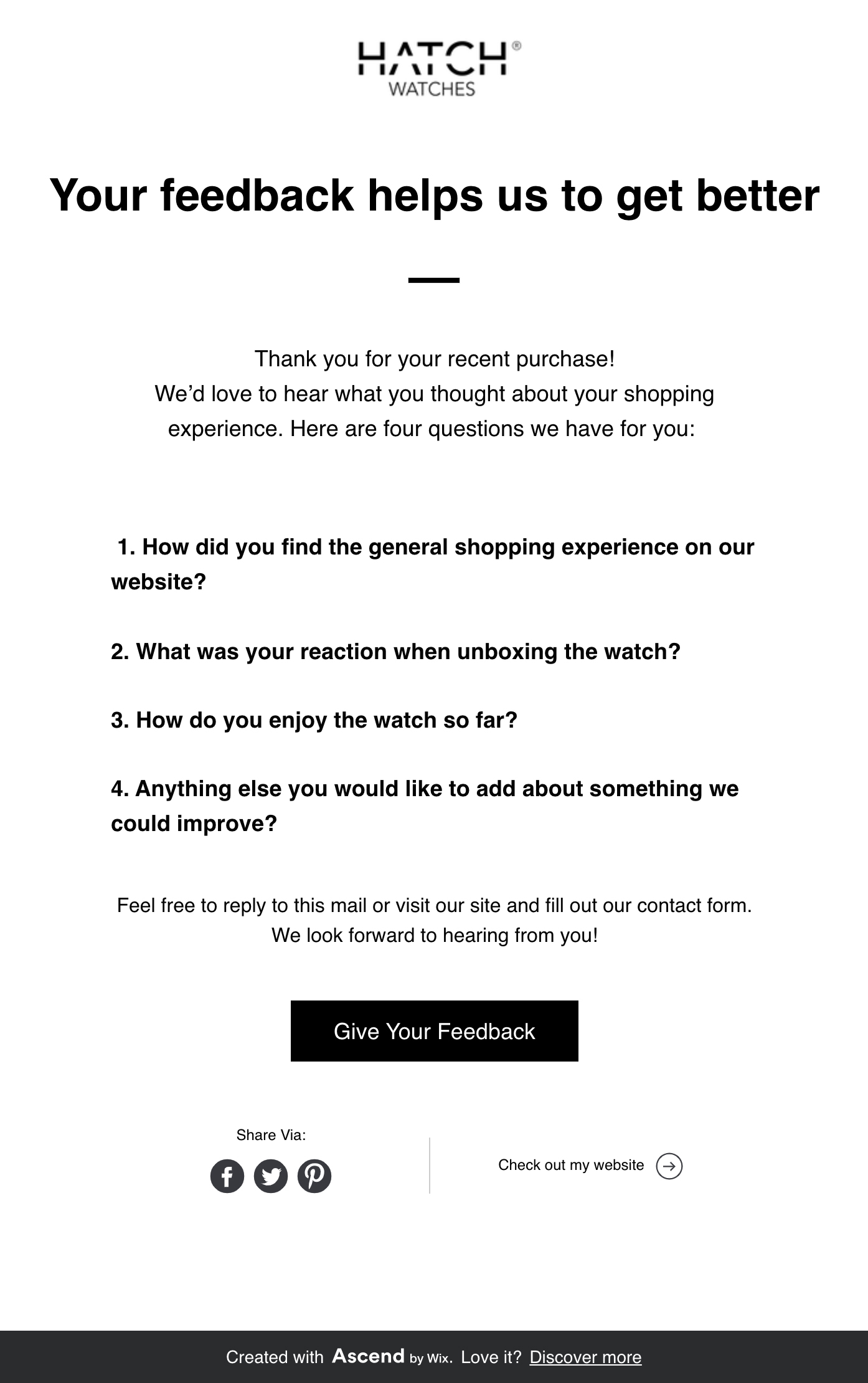
We implemented an automatic email that asks all our recent customers to provide feedback on their experience. This helped us to assess the quality of our service and their satisfaction.
To keep our creative community engaged, we created a blog page with short yet inspiring articles around themes we identified in our customer’s work and likes on social media. We made sure it worked well both on mobile and tablet.
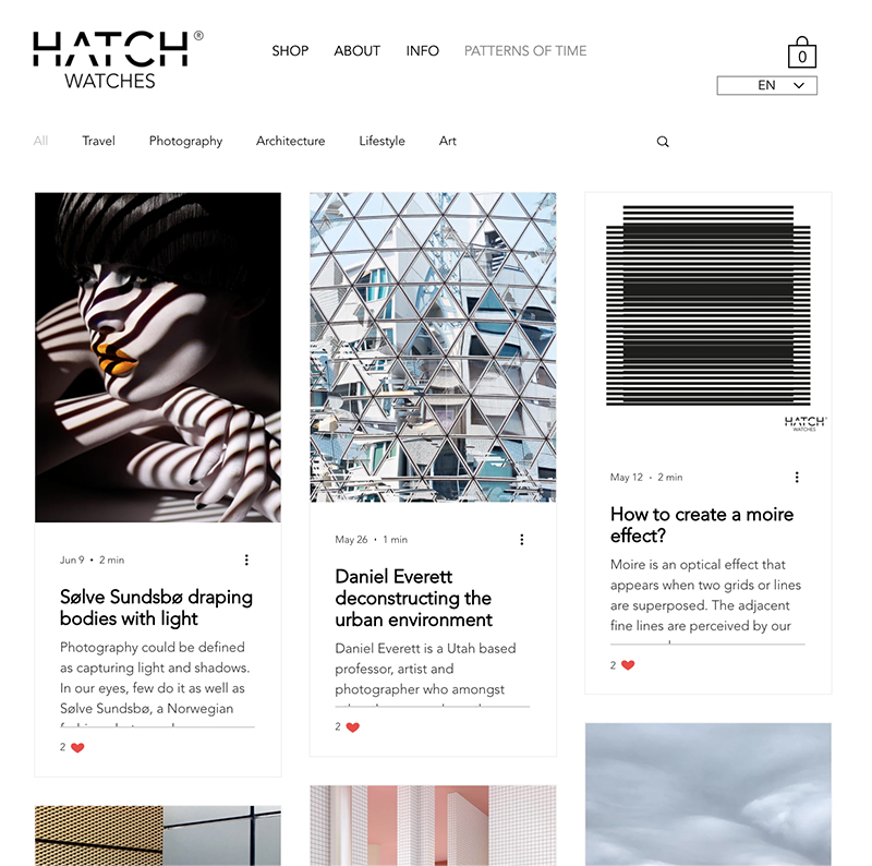
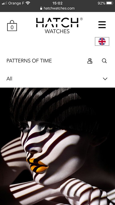
We also worked on the website flows and improved the navigation and translated our entire website into French.
Impact & Takeways
Impact
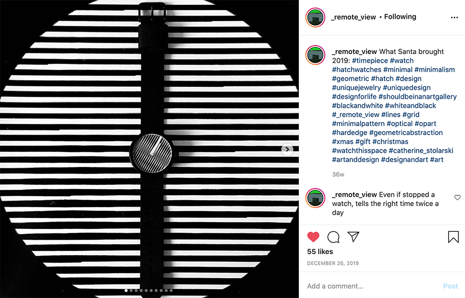
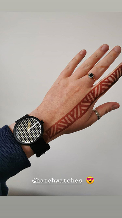
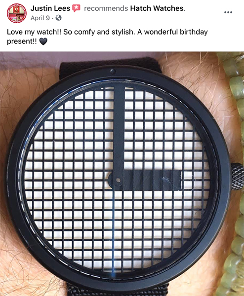
It is very heart-warming and humbling to see that we have created something that people love to the extent of taking the time to write us a personalised email or share photos on social media. The perks of a happy creative community are that every photo of your product they share is professional and beautiful!
In numbers
comparing year 2018-19 to 2017-18
+7%
conversion rate
x4
more website visits
25%
of the stock sold within 6 months
+ the SHOP page in 1st interaction after the HOME page
+ PRODUCT pages are the most common 2nd interactions, followed by BLOG pages and STORY page
In images
Takeaways
I had to experience what it is to be in the shoes of a retail business owner and I understand now what type of challenges and blind spots they might have and the importance of getting external feedback on what you are doing as you tend to be emotionally involved with your project and your judgment might lack objectivity.
The hardship of selling a product is something I clearly underestimated and I am happy to be back to selling only creative services.


